
# echarts-wordcloud
# 仓库
https://github.com/ecomfe/echarts-wordcloud (opens new window)
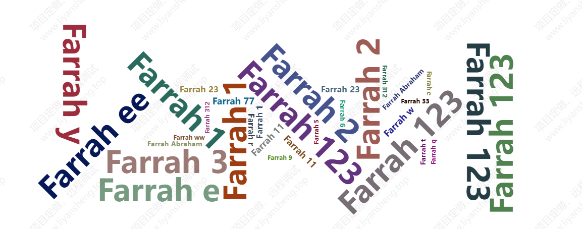
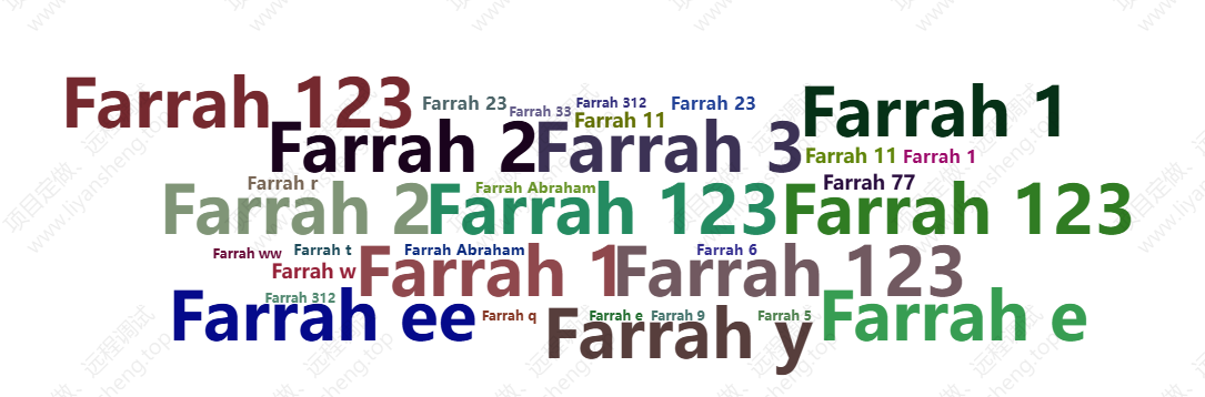
# 效果
# 依赖
  "dependencies": {
    "echarts-wordcloud": "^2.0.0",
    "echarts": "^5.1.2"
  },
然后执行npm install
# 基本使用
词云的形状,有以下预设值:
circle: 圆形(默认)cardioid: 心形(苹果形曲线)。diamond/square: 菱形 / 正方形。triangle-forward: 向前的三角形。triangle/triangle-upright: 正三角形。pentagon: 五边形。star: 星形。
举例
<template>
    <div>
        <div id="tlrealtimewordcloud" style="width: 100%;height: 500px;"></div>
    </div>

</template>

<script>
import * as echarts from 'echarts'
import 'echarts-wordcloud'
export default {
    mounted() {
        // 页面渲染完成后进行
        this.$nextTick(() => {
            this.initChart();
        });
    },
    methods: {
        initChart() {
            // 这里和echarts的使用一样,先拿到容器元素
            const chart = echarts.init(document.getElementById('tlrealtimewordcloud'))
            // 这里是官方给出的一些基本的配置项,我做一些说明
            chart.setOption({
                series: [{
                    type: 'wordCloud',
                    // shape这个属性虽然可配置,但是在词的数量不太多的时候,效果不明显,它会趋向于画一个椭圆
                    shape: 'square',
                    keepAspect: false,
                    // 这个是可以自定义背景图片的,词云会按照图片的形状排布,所以有形状限制的时候,最好用背景图来实现,而且,这个背景图一定要放base64的,不然词云画不出来
                    // maskImage: maskImage,
                    // 下面就是位置的配置
                    left: 'center',
                    top: 'center',
                    width: '70%',
                    height: '80%',
                    right: null,
                    bottom: null,
                    // 词的大小,最小12px,最大60px,可以在这个范围调整词的大小
                    sizeRange: [12, 60],
                    // 每个词旋转的角度范围和旋转的步进
                    rotationRange: [-90, 90],
                    rotationStep: 45,
                    // 词间距,数值越小,间距越小,这里间距太小的话,会出现大词把小词套住的情况,比如一个大的口字,中间会有比较大的空隙,这时候他会把一些很小的字放在口字里面,这样的话,鼠标就无法选中里面的那个小字,这里可以用函数根据词云的数量动态返回间距
                    gridSize: 8,
                    // 允许词太大的时候,超出画布的范围
                    drawOutOfBound: false,
                    // 布局的时候是否有动画
                    layoutAnimation: true,
                    // 这是全局的文字样式,相对应的还可以对每个词设置字体样式
                    textStyle: {
                        fontFamily: 'sans-serif',
                        fontWeight: 'bold',
                        // 颜色可以用一个函数来返回字符串,这里是随机色
                        color: function () {
                            // Random color
                            return 'rgb(' + [
                                Math.round(Math.random() * 160),
                                Math.round(Math.random() * 160),
                                Math.round(Math.random() * 160)
                            ].join(',') + ')';
                        }
                    },
                    emphasis: {
                        focus: 'self',
                        textStyle: {
                            textShadowBlur: 10,
                            textShadowColor: '#333'
                        }
                    },

                    // 数据必须是一个数组,数组是对象,对象必须有name和value属性
                    data: [{
                        name: 'Farrah 123',
                        value: 366,
                    }, {
                        name: 'Farrah 123',
                        value: 366,
                    }, {
                        name: 'Farrah 1',
                        value: 366,
                    },]
                }]
            });

        },
    }
};
</script>
# 进阶用法

Tooltip 提示:
- 在
tooltip.formatter中自定义显示内容。 - 除了词的名称,还添加了提示“点击可以前往”。
tooltip: {
    trigger: 'item',
    formatter: function (params) {
    // 显示提示信息
    return `${params.name}<br><span style="color: gray;">点击可以前往</span>`;
    }
},
事件监听:
- 点击事件保留,用于跳转到对应链接。
- 未添加
link属性的词不会触发点击。
            // 添加点击事件监听
            chart.on('click', function (params) {
                if (params.data && params.data.link) {
                    // 跳转到指定链接
                    window.open(params.data.link, '_blank');
                }
            });
数据样例:
            var data = [
                { name: 'Google', value: 100, link: 'https://www.google.com' },
                { name: 'Bing', value: 80, link: 'https://www.bing.com' },
                { name: 'Yahoo', value: 60, link: 'https://www.yahoo.com' },
                { name: 'Baidu', value: 50, link: 'https://www.baidu.com' }
            ];
样式调整:
- 提示文字通过
<span>标签设置灰色 (gray)。