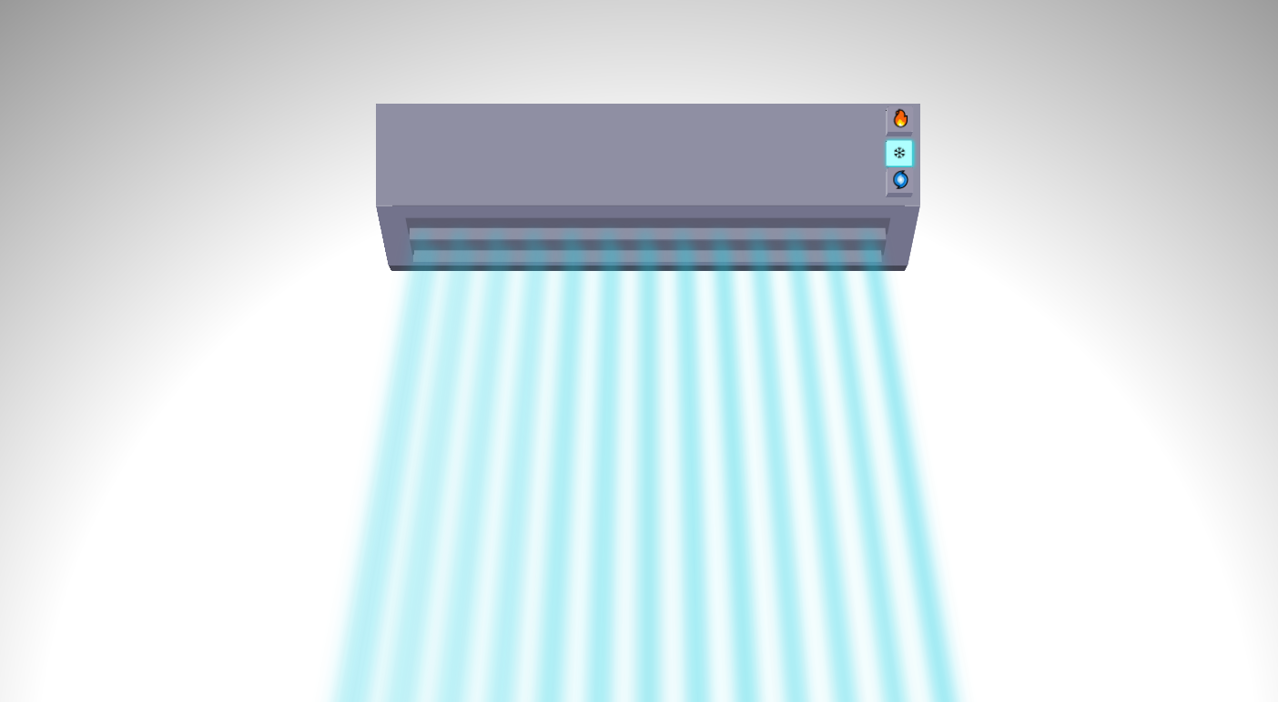
# 🌀虚拟空调自由

-18a2ea)
# 参考
<!DOCTYPE html>
<html lang="en">
<head>
<meta charset="UTF-8">
<meta name="viewport" content="width=device-width, initial-scale=1.0">
<title>实现空调自由</title>
<style>
.cuboid {
--height: 6;
--width: 6;
--depth: 6;
--hue: 240;
--sat: 10%;
--lum: 40%;
height: calc(var(--height) * 1vmin);
width: calc(var(--width) * 1vmin);
position: absolute
}
.cuboid .side {
position: absolute;
top: 50%;
left: 50%;
height: 100%;
width: 100%;
border-radius: 2px;
background: hsl(var(--hue), var(--sat), var(--lum))
}
.cuboid .side:nth-of-type(1) {
transform: translate3d(-50%, -50%, calc(var(--depth) * 0.5vmin));
--lum: 60%
}
.cuboid .side:nth-of-type(2) {
transform: translate3d(-50%, -50%, calc(var(--depth) * -0.5vmin)) rotateY(180deg)
}
.cuboid .side:nth-of-type(3) {
width: calc(var(--depth) * 1vmin);
transform: translate(-50%, -50%) rotateY(90deg) translate3d(0, 0, calc(var(--width) * 0.5vmin));
--lum: 70%
}
.cuboid .side:nth-of-type(4) {
width: calc(var(--depth) * 1vmin);
transform: translate(-50%, -50%) rotateY(-90deg) translate3d(0, 0, calc(var(--width) * 0.5vmin));
--lum: 70%
}
.cuboid .side:nth-of-type(5) {
height: calc(var(--depth) * 1vmin);
transform: translate(-50%, -50%) rotateX(90deg) translate3d(0, 0, calc(var(--height) * 0.5vmin));
--lum: 20%
}
.cuboid .side:nth-of-type(6) {
height: calc(var(--depth) * 1vmin);
transform: translate(-50%, -50%) rotateX(-90deg) translate3d(0, 0, calc(var(--height) * 0.5vmin));
--lum: 50%
}
.cuboid .side:nth-of-type(7) {
height: calc(var(--depth) * 0.225vmin);
transform: translate(-50%, -50%) rotateX(-90deg) translate3d(0, 2.25vmin, calc(var(--height) * 0.5vmin));
--lum: 30%
}
* {
transform-style: preserve-3d;
box-sizing: border-box
}
body {
display: flex;
align-items: center;
justify-content: center;
padding: 0;
margin: 0;
width: 100vw;
height: 100vh;
overflow: hidden;
perspective: 100vmin;
perspective-origin: bottom;
background: radial-gradient(circle at 50% 100%, #fff, #fff, #666)
}
.content {
width: 80vmin;
height: 50vmin;
transform: rotateY(0deg) rotateX(0deg)
}
.box {
--width: 60;
--height: 15
}
.ac {
left: 10vmin;
position: absolute;
z-index: 1
}
.cuboid.box>.side:nth-of-type(1) {
clip-path: polygon(0% 0%, 100% 0%, 100% 75%, 0% 75%, 0% 100%)
}
.cuboid.box>.side:nth-of-type(3) {
clip-path: polygon(0% 0%, 100% 0%, 100% 100%, 75% 100%, 0% 75%)
}
.cuboid.box>.side:nth-of-type(4) {
clip-path: polygon(0% 0%, 100% 0%, 100% 75%, 25% 100%, 0% 100%)
}
.box>.side:nth-of-type(6) {
transform: translate(-50%, -50%) rotateX(-50deg) translate3d(0vmin, 3.2vmin, 4.75vmin);
background: linear-gradient(180deg, hsl(var(--hue), var(--sat), var(--lum)) 1.1vmin, #fff0 0 calc(100% - 3.15vmin), hsl(var(--hue), var(--sat), var(--lum)) 0 calc(100% - 2.55vmin), #fff0 0 calc(100% - 1vmin), hsl(var(--hue), var(--sat), var(--lum)) 0 100%), linear-gradient(90deg, hsl(var(--hue), var(--sat), var(--lum)) 3vmin, #fff0 3vmin calc(100% - 3vmin), hsl(var(--hue), var(--sat), var(--lum)) 0 100%)
}
.box>.side:nth-of-type(6):before,
.box>.side:nth-of-type(6):after {
content: "";
--lum: 60%;
position: absolute;
background: hsl(var(--hue), var(--sat), var(--lum));
width: 53.5vmin;
height: 1.5vmin;
top: 1.225vmin;
left: 3.25vmin;
transform-origin: 50% 75%;
transform: rotateX(0deg);
animation: fanfan-move 8s ease-in-out 0s infinite;
animation-play-state: paused
}
@keyframes fanfan-open {
100% {
transform: rotateX(-120deg)
}
}
@keyframes fanfan-close {
0% {
transform: rotateX(-120deg)
}
100% {
transform: rotateX(0deg)
}
}
@keyframes fanfan-move {
0%,
100% {
transform: rotateX(-120deg)
}
50% {
transform: rotateX(-40deg)
}
}
#btn-off:checked~.content .ac .box>.side:nth-child(6):before,
#btn-off:checked~.content .ac .box>.side:nth-child(6):after {
animation: fanfan-close 4s ease-in-out 0s 1;
animation-fill-mode: forwards
}
#btn-hot:checked~.content .ac .box>.side:nth-child(6):before,
#btn-hot:checked~.content .ac .box>.side:nth-child(6):after,
#btn-cold:checked~.content .ac .box>.side:nth-child(6):before,
#btn-cold:checked~.content .ac .box>.side:nth-child(6):after {
animation: fanfan-open 4s ease-in-out 0s 1;
animation-fill-mode: forwards
}
#btn-hot:checked~#btn-fan:checked~.content .ac .box .side:nth-child(6):before,
#btn-hot:checked~#btn-fan:checked~.content .ac .box .side:nth-child(6):after,
#btn-cold:checked~#btn-fan:checked~.content .ac .box .side:nth-child(6):before,
#btn-cold:checked~#btn-fan:checked~.content .ac .box .side:nth-child(6):after {
animation: fanfan-move 8s ease-in-out 0s infinite
}
.box>.side:nth-of-type(6):after {
top: 3.5vmin
}
label {
transform: translateZ(3vmin);
position: absolute;
right: 1vmin;
top: 0.85vmin;
height: 2.825vmin;
min-width: 2.825vmin;
cursor: pointer;
font-size: 1.75vmin;
transition: 0.4s ease 0s
}
label[for="btn-cold"] {
top: 4.2vmin
}
label[for="btn-fan"] {
top: 7.5vmin
}
label[for="btn-off"] {
background: repeating-linear-gradient(90deg, #4caf50 0 3px, #fff0 0 7px);
background: #fff0;
top: 9.5vmin;
transform: translateZ(3.5vmin)
}
#btn-hot:checked~.content .ac .box label[for="btn-off"] {
top: 0.85vmin
}
#btn-cold:checked~.content .ac .box label[for="btn-off"] {
top: 4.2vmin
}
#btn-off:checked~.content .ac .box label[for="btn-off"] {
opacity: 0;
pointer-events: none
}
label.cuboid {
--width: 2.8;
--height: 2.8;
--depth: 1.5
}
label.cuboid .side:first-child {
display: flex;
align-items: center;
justify-content: center;
line-height: 0;
background: #9794a9
}
#btn-hot:checked~.content .ac .box label[for="btn-hot"],
#btn-cold:checked~.content .ac .box label[for="btn-cold"],
#btn-fan:checked~.content .ac .box label[for="btn-fan"] {
transform: translateZ(2.5vmin)
}
#btn-hot:checked~.content .ac .box label[for="btn-hot"] .side:nth-child(1) {
background: #f59;
box-shadow: 0 0 6px 1px #f00
}
#btn-cold:checked~.content .ac .box label[for="btn-cold"] .side:nth-child(1) {
background: #aeffff;
box-shadow: 0 0 6px 1px cyan
}
#btn-fan:checked~.content .ac .box label[for="btn-fan"] .side:nth-child(1) {
background: #fff;
box-shadow: 0 0 6px 1px #fff
}
input {
display: none
}
.air {
position: absolute;
width: 66%;
height: 150%;
left: 17%;
transform-origin: 50% 0;
transform: rotateX(25deg) translateZ(0.5vmin);
top: 27%;
z-index: -1
}
.air:before,
.air:after {
--air: #00f3;
position: absolute;
width: 100%;
height: 0%;
min-height: 0;
background: repeating-linear-gradient(90deg, #fff0 0 3vmin, var(--air) 4.15vmin);
content: "";
filter: blur(10px);
transition: all 1.5s ease 2s;
transform: translateZ(1vmin);
background-size: 200% 100%;
background-repeat: repeat;
background-position: 0% 0;
animation: air-fan2 40s linear 0s infinite alternate
}
.air:after {
transform: translateZ(-1vmin) rotate(180deg)
}
#btn-hot:checked~#btn-fan:checked~.content .air,
#btn-cold:checked~#btn-fan:checked~.content .air {
animation: air-fan 4s ease-in-out 0s infinite alternate
}
@keyframes air-fan {
100% {
transform: rotateX(80deg);
background-position: 100% 0
}
}
@keyframes air-fan2 {
100% {
background-position: 100% 0
}
}
#btn-hot:checked~.content .air:before,
#btn-hot:checked~.content .air:after {
min-height: 80vmin;
--air: rgb(255, 55, 0)
}
#btn-cold:checked~.content .air:before,
#btn-cold:checked~.content .air:after {
min-height: 80vmin;
--air: rgba(16, 205, 226, 0.788)
}
</style>
</head>
<body>
<input type="radio" name="btns" id="btn-hot">
<input type="radio" name="btns" id="btn-cold">
<input type="radio" name="btns" id="btn-off" checked>
<input type="checkbox" name="fan" id="btn-fan">
<div class="content">
<div class="ac">
<div class="cuboid box">
<div class="side"></div>
<div class="side"></div>
<div class="side"></div>
<div class="side"></div>
<div class="side"></div>
<div class="side"></div>
<div class="side"></div>
<label for="btn-hot" class="cuboid">
<div class="side">🔥</div>
<div class="side"></div>
<div class="side"></div>
<div class="side"></div>
<div class="side"></div>
<div class="side"></div>
</label>
<label for="btn-cold" class="cuboid">
<div class="side">❄</div>
<div class="side"></div>
<div class="side"></div>
<div class="side"></div>
<div class="side"></div>
<div class="side"></div>
</label>
<label for="btn-fan" class="cuboid">
<div class="side">🌀</div>
<div class="side"></div>
<div class="side"></div>
<div class="side"></div>
<div class="side"></div>
<div class="side"></div>
</label>
<label for="btn-off"></label>
</div>
</div>
<div class="air"></div>
</div>
<script>
var rotateDiv = document.getElementById('rot'); var rotateIcons = document.getElementById('rot-icons'); var clickRotateDiv = document.getElementById('click-rot'); var angle = 0; clickRotateDiv.onclick = function () { angle += 60; rotateDiv.style.transform = 'rotate(' + angle + 'deg)'; rotateIcons.style.transform = 'rotate(' + angle + 'deg)' }; var step = 2; var color1 = 'rgba(0,0,0,0.5)'; var color2 = 'rgba(0,0,0,0.1)'; var gradient = ' conic-gradient('; for (var i = 0; i < 360; i += step) { var color = i % (2 * step) === 0 ? color1 : color2; gradient += color + ' ' + i + 'deg, ' } gradient = gradient.slice(0, -2) + '), rgb(85 93 108)'; rotateDiv.style.background = gradient; var toggles = document.querySelectorAll('.toggle'); var tempElement = document.querySelector('.temp'); let isAnimating = false; toggles.forEach(function (toggle) { toggle.addEventListener('click', function () { if (this.classList.contains('active') || isAnimating) { return } toggles.forEach(function (toggle) { toggle.classList.remove('active') }); this.classList.add('active'); var tempValue = parseFloat(tempElement.textContent); if (this.id === 'toggle-cel') { var celsius = Math.round((tempValue - 32) * 5 / 9); tempElement.textContent = celsius + '°C' } else if (this.id === 'toggle-far') { var fahrenheit = Math.round(tempValue * 9 / 5 + 32); tempElement.textContent = fahrenheit + '°F' } }) }); let currentTempF = 34; function easeInOutCubic(t) { return t < .5 ? 4 * t * t * t : (t - 1) * (2 * t - 2) * (2 * t - 2) + 1 } function changeTemp(element, newTemp) { let unit = element.innerHTML.includes("F") ? "°F" : "°C"; let currentTemp = unit === "°F" ? currentTempF : Math.round((currentTempF - 32) * 5 / 9); let finalTemp = unit === "°F" ? newTemp : Math.round((newTemp - 32) * 5 / 9); let duration = 2000; let startTime = null; function animate(currentTime) { if (startTime === null) { startTime = currentTime } let elapsed = currentTime - startTime; let progress = Math.min(elapsed / duration, 1); progress = easeInOutCubic(progress); let tempNow = Math.round(currentTemp + (progress * (finalTemp - currentTemp))); element.innerHTML = `${tempNow}${unit}`; if (progress < 1) { requestAnimationFrame(animate) } else { currentTempF = newTemp; isAnimating = false } } isAnimating = true; requestAnimationFrame(animate) } window.onload = function () { const sixths = Array.from(document.querySelectorAll('.sixths')); let index = 0; let temp = document.querySelector('.temp'); document.querySelector('#rot-icons').addEventListener('click', () => { sixths[index].classList.remove('active'); index = (index + 1) % sixths.length; sixths[index].classList.add('active'); if (index == 0) { changeTemp(temp, 34); console.log("sun")document.querySelector('#mountains').classList.remove("snow"); document.querySelector('#mountains').classList.remove("clouds") } else if (index == 1) { changeTemp(temp, 27); console.log("sunset")document.querySelector('#mountains').classList.add("sunset") } else if (index == 2) { changeTemp(temp, 14); console.log("moon")document.querySelector('#mountains').classList.remove("sunset"); document.querySelector('#mountains').classList.add("moon") } else if (index == 3) { changeTemp(temp, 16); console.log("clouds")document.querySelector('#mountains').classList.add("clouds") } else if (index == 4) { changeTemp(temp, 8); console.log("storm")document.querySelector('#mountains').classList.add("storm") } else if (index == 5) { changeTemp(temp, -4); console.log("snow")document.querySelector('#mountains').classList.remove("moon"); document.querySelector('#mountains').classList.remove("storm"); document.querySelector('#mountains').classList.add("snow") } let loadingBar = document.querySelector('.loading-bar'); loadingBar.classList.add('active'); setTimeout(() => { loadingBar.classList.remove('active') }, 1200) }) };
</script>
</body>
</html>
# 效果